For this assignment, I decided to work on an infographic I made for a course I took last semester, HLTH 321 (Human Resource and Fiscal Management in Community Health Systems). We were asked to create an infographic to describe some of the ways employees are retained and the strategies used.
Below, is my initial infographic.
Below is the after effect.
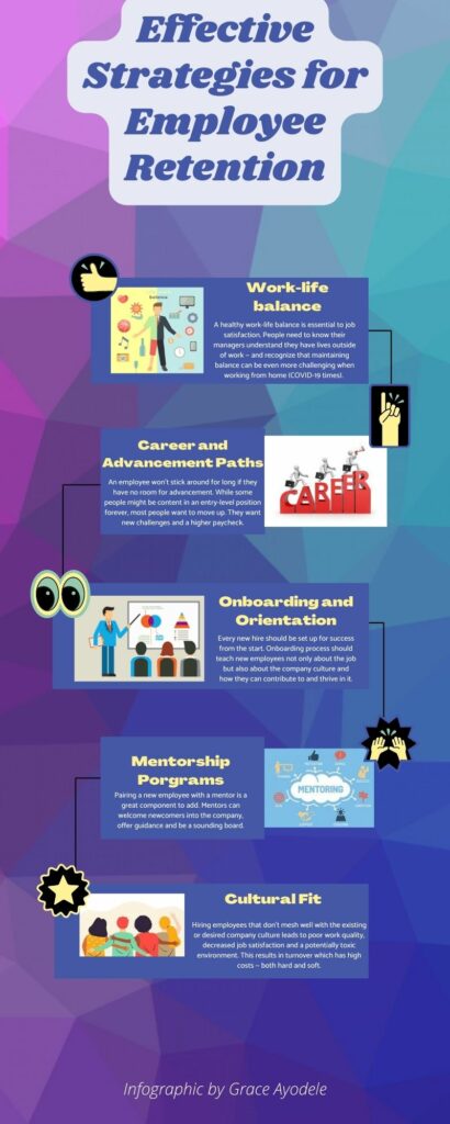
The main difference, clearly, is that I decided to add images / elements to make the infographic more enjoyable to read and follow. Rather than just having paragraphs to read, alone, I decided to add images that relates to each heading. I also added elements to make each paragraph connect to the other, for an easier flow. I added colours that are pleasing to the eyes, that is, not too bright and not too dim, but just the right amount of colour. The paragraph length remained the same, as I believe it’s just the right amount of words. So it’s just enough to pass across the message i’m trying to deliver.
The first point “Work-life balance”, I added an image which visualized what a work-life balance is.
The second point ” Career Advancement Paths”, I added and image which signifies a person moving up in their career.
The third point, which is Onboarding and Orientation, the image used an example of what an onboarding / orientation would look like.
The fourth point, Mentorship program, it was a bit hard to find the right picture, but the one used describes the different mentorship programs available.
Lastly, the fifth point, Cultural Fit (probably my favourite point), the image used is four different people, all from different races and culture.
The changes made to my infographic would come in very handy for visual learners especially. The corresponding images next to the headings makes it easier to understand and follow along.
Leave a Reply
You must be logged in to post a comment.